What makes a good brand pivot?
Design firm Under Consideration on how, when, and why brands should approach pivots.
Written by Jonathan Simcoe
Illustrations by Kaitlin Banafsheha
Husband and wife Armin Vit and Bryony Gomez-Palacio run design firm UnderConsideration and blog Brand New, the latter of which they use to explore brand re-designs and pivots. Brand New started in 2006 as a spinout from their original blog Speak Up.
“It was sort of the first graphic design blog,” Vit says. With Brand New, the team has reviewed thousands of brand pivots (admiring some companies, lambasting others), been caught in the crosshairs of fervent internet drama, and hold a beloved, veteran place in the world of brand re-designs.
~
Has Under Consideration pivoted?
Yeah. At the start, we split 50% of our time doing work for clients, 50% for our own projects. But then we got a lot of client work. So 90% of our business was dedicated to client work and not so much of our own stuff. In 2009, the recession hit. We ran out of clients and were like oh, now we literally have to pivot and learn to make money on our own.
A year later, we started the Brand New conference. From 2010-20, 30% of our time was spent on design work for clients. And in the past year, 0% was spent on design work. It’s never been a hard pivot, but we’ve evolved and adapted to the needs of our environment.
A lot of the times you haven’t prepared for the changes that come your way. It’s about adaptability: what can we do next, what can we evolve to to match the world?
I’m a big fan of your blog where you feature different brand pivots. Let’s start with the key elements of a brand. What exactly makes a brand?
A brand is the totality of a product, company, or service, from the name to the logo to how they speak to how they dress. It’s how they answer the phone, their customer experience, their emails. At Under Consideration, we often shorten it to mean just the visual expression, but this comes from the inside out.
There’s a lot of depth to Under Consideration’s work, and you go deeper than the visuals. But it seems like visuals are often the baseline.
What visual identity does is give a visual manifestation to the mission, the vision, and the strategy of the company. This can trigger deeper associations, like a green that makes you think of other similar brands. It’s actually not about the colors or the type you choose, but the things that go into informing those choices.
At what point should a brand pivot?
No one goes, “I really like pretty logos so I want one.” A brand pivot is a business decision. The typical cases are changing leadership — new CEO, new executive director, new artistic director. We need to signal that there’s someone new in charge, or maybe that person wants to make their mark on the business.
Other times, a company is expanding or going public. Going public is usually a sign that there will be a new logo for a company.
A great example is Airbnb. Their new logo in 2014 came to represent that moment when Airbnb went from being a way to stay on people’s couches to competing against major hotel chains. The decision to move the business in a certain direction was made long before the logo was designed, but the logo came to represent the moment. Could Airbnb have successfully transitioned without it?
What elements do you focus on when a brand is pivoting? What’s important, what’s less important?
Remember the Tropicana package that changed? I remember going to the grocery store to pick out a carton and couldn’t find the juice. They had placed it in the exact same aisle, but the branding was different. And I got upset. But eventually I moved on.
A lot of brand pivots are about having the confidence to commit to the change. Whenever you see a company announce a redesign and go back to the old thing once people complain, that shows that leadership wasn’t convinced. In most cases, good design is a reflection of a good business decision.
Then, of course, you need to keep the natural conversations that will emerge from your redesign in mind, how people want to talk about your business. How do you want to be remembered? Do you want to be friendly? Innovative? Old-fashioned?
What’s an example of an iconic brand pivot that you consider successful?
I keep coming back to Airbnb. It’s hard not to. When the logo came out, everyone said, “hey it looks like something lewd.” But the company stood by their decision and now no one thinks that logo means anything other than Airbnb. It’s a great example of using a redesign of a logo at a moment to show that a company wanted to grow.
What part of the visual implementation was so successful?
I think they just had a major change, not just in personality but in presence. It went from a cartoon-y font with a gray gradient to something more elevated. It was like wearing shorts and a T-shirt, and all of a sudden you’ve changed into a nice button-down shirt, slacks, nice shoes, and got a haircut. It was such a drastic change at the most basic level.
Slack is another example. They went from a hashtag to something that a lot of people made bad comparisons too. I wasn’t too keen on the logo, but it was part of a functional improvement. It was very necessary. No one thinks about the Slack logo anymore. They just use it because they need to. Slack is just a good product.
A lot of brand pivots are about having the confidence to commit to the change.
What’s the most infamous, maybe worst, brand pivot you’ve ever seen?
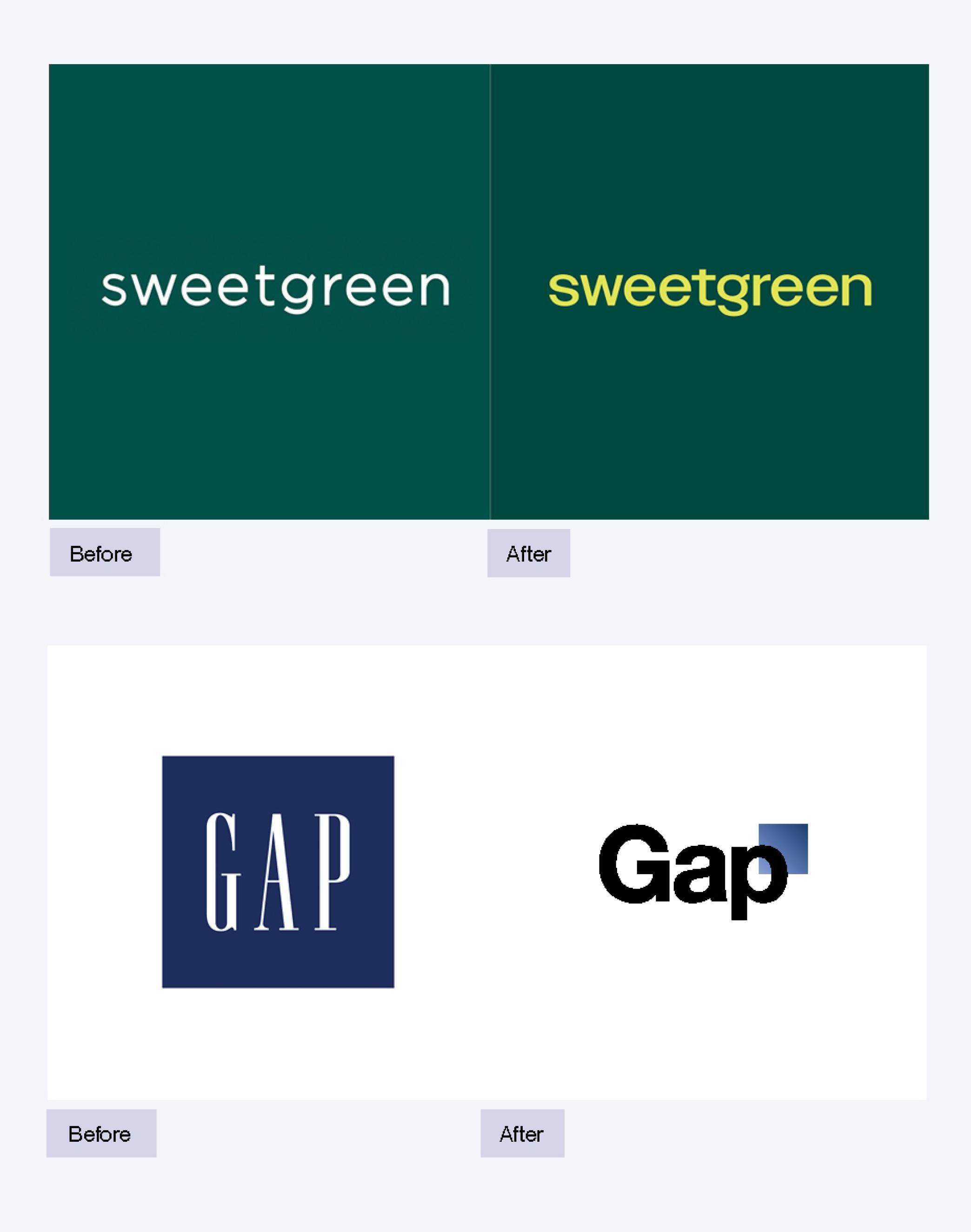
I think it’s the GAP incident. Do you remember it? It was before brands really had a big presence on social media. For a while, GAP had a nice Serif, very nice, very elegant. And one day, without any warning, they changed the font and added a square gradient. And everyone — designers, non-designers — was like, what the hell just happened? GAP decided to undo it and held a public contest to submit logos.
Those were in the early days of Twitter. The GAP parody account got big. People got fired. I think that was the worst pivot I can remember, not just because the design was bad but because of how communication was handled. Someone probably changed it on a personal whim. Maybe it was new leadership that wanted to make a mark and signed it behind closed doors.
Should GAP just have leaned into it and stayed confident?
It’s funny, but in 2023, if you said, GAP is changing the logo to a simple square, I’d be like, that’s ballsy. If they did a proper rollout with an identity, a story, a press release, it would have gone a long way. The execution could have even stayed the same, but just with the right rollout and communication and expectation-setting, that something might change soon, it could come to pass.
More Like This